
In the ever-evolving world of design, trends come and go. But one style has stubbornly stayed in the spotlight for the past few years: Brutalism Typography. Known for its bold, raw, and rebellious look, brutalist fonts break the rules and that’s exactly why designers love them.
As we head toward 2025, one question keeps popping up: Is brutalism here to stay? Or will it slowly fade into the background as smoother, cleaner aesthetics take over? Let’s dive into what the future might hold.
Brutalism in typography draws inspiration from brutalist architecture—harsh lines, concrete blocks, and a “what you see is what you get” attitude. In type design, brutalism often means:
This isn’t the kind of typography that tries to be “pretty.” Instead, it’s about impact. It’s loud, it’s experimental, and it doesn’t care about playing safe.
Over the past few years, brutalist fonts have exploded in the design scene. Here’s why:
From indie fashion brands to experimental websites and music promos, brutalist fonts offer a visual punch that says: “I don’t follow the rules.”
So, will brutalism still be trending in 2025? The short answer: YES—but it’s evolving.
Here’s what we predict:
1. Soft Brutalism is on the Rise
Designers will still use brutalist principles—bold text, aggressive spacing, contrast—but combine them with softer colors, rounded elements, and clean backgrounds. Think “brutal but accessible.”
2. Hybrid Layouts Will Dominate
Instead of going full-brutalist, many will use brutal fonts only for headlines or hero sections, while the rest of the layout remains neat and digestible. It creates tension—but in a good way.
3. Experimental Glyphs and Alternates
Expect to see more fonts offering wild alternates, distorted letterforms, and custom ligatures that let designers fine-tune the brutalism aesthetic to match their voice.
If your brand wants to look edgy, bold, and a little rebellious—brutalist fonts are perfect. They're especially great for:
In short, brutalist fonts are made for those who don’t want to blend in.
If you’re ready to ride the brutalism wave in 2025, we’ve got the goods. Here are some bold picks from our collection:
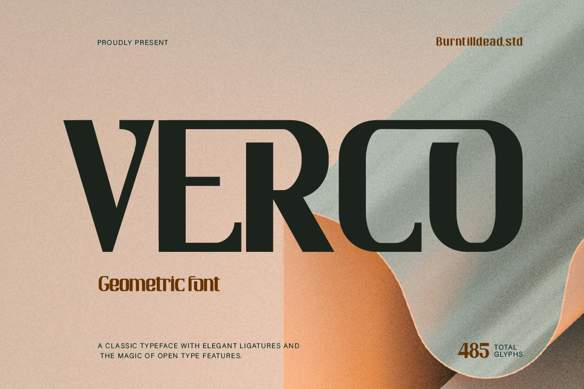
Verco – Geometric fonts characterized by clean and structured shapes. The clean shape such as square, triangle and circle, create a striking visual impact and making them minimalist aesthetic and modern.
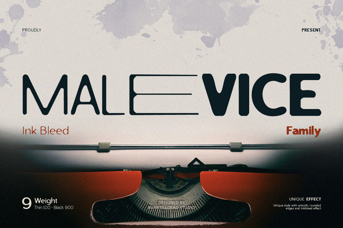
Malevice Inkbleed – A unique font with smooth, rounded edges and an eye-catching inkbleed effect.
Versilo – Sans serif font with script as the alternates. This typeface very easy to read.
 Frelon – A futuristic font with a modern touch. Frelon is a unique and dynamic typeface designed for those who love bold and futuristic styles.
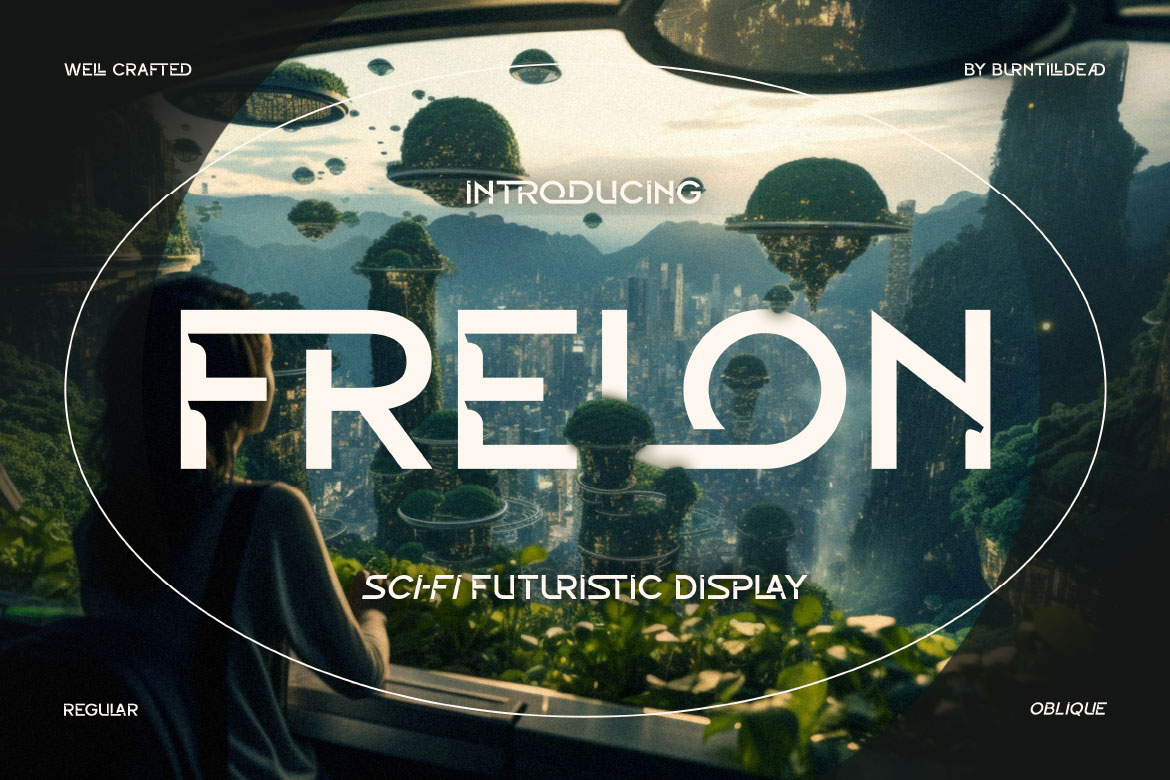
Find them all at burntilldeadstudio.com and unleash your rawest designs yet.
Trends may shift, but brutalism has become more than just a passing phase. It represents a mindset—a refusal to be polished, a celebration of rawness, and a craving for authenticity in a digital world full of sameness.
In 2025, brutalism won’t disappear. It’ll transform. We’ll see it get softer, smarter, and more hybrid. But that rebellious spirit? Still very much alive.
So whether you’re designing a poster that punches hard, a website that disrupts, or a brand that refuses to play it safe—brutalist fonts are still your best friend.