
Ever watched a sci-fi movie and thought, “Wait, that font looks familiar…” or maybe stared at the NASA logo wondering why it feels so timeless? Behind the advanced technology and futuristic visuals, there’s one subtle yet powerful element tying it all together: typography.
Whether it’s real-life space missions or cinematic universes set lightyears away, fonts play a big role in how we experience and understand space. Let’s explore how typography shapes the aesthetics of both NASA’s branding and iconic sci-fi films.
NASA’s choice of typography isn’t just about looks, it’s about clarity, function, and authority. One of the most iconic fonts associated with NASA is Helvetica, a clean and neutral sans-serif typeface widely used in the agency’s documentation since the 1970s.
Then there’s the legendary “worm” logo, reintroduced in 2020 after decades of retirement. Its sleek, rounded custom type feels futuristic even today, with its minimal lines and open letterforms.
NASA also favors simple, legible fonts on control panels, data sheets, and technical manuals. In an environment where readability can be the difference between success and failure, sans-serif fonts dominate for their high legibility and no-frills design.
Typography in science fiction films is more than just style—it helps build entire worlds. Filmmakers use fonts to hint at advanced civilizations, military regimes, dystopian futures, or alien languages. Here are a few examples:
Fonts in sci-fi aren’t just decoration—they’re part of the storytelling. A well-chosen typeface can instantly signal “the future,” even before a single word is spoken.
Fonts used in space-related design or sci-fi visuals often have similar traits:
They often appear on spaceship dashboards, mission patches, or holographic UI screens—adding authenticity and depth to the experience.
Looking to capture that cosmic vibe in your design? Here are some font suggestions that channel the spirit of outer space from Burntilldead:
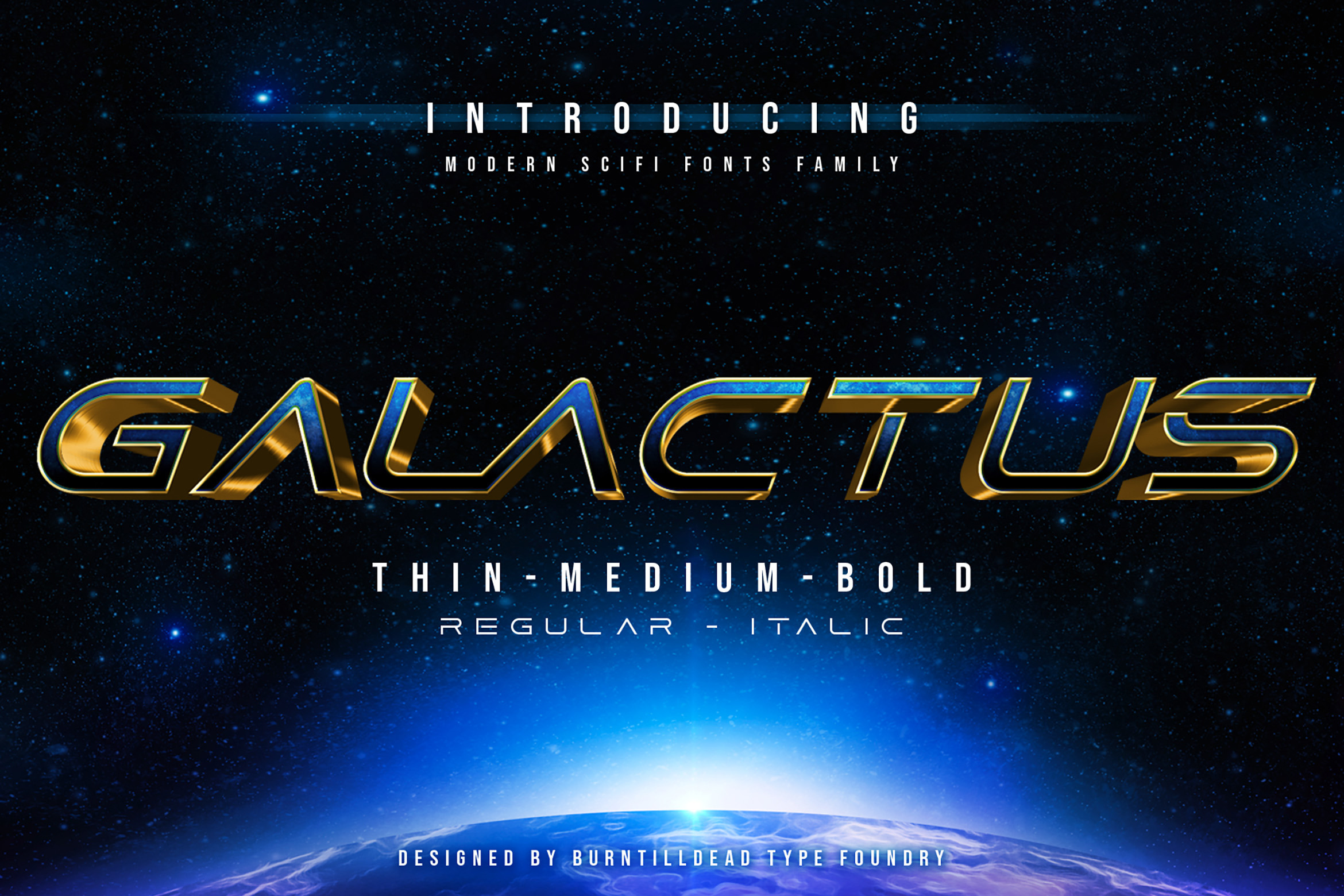


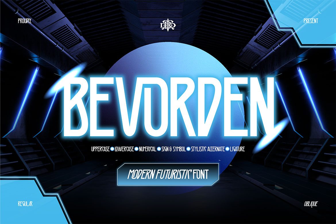

These fonts work great for posters, UI designs, title screens, and branding with a sci-fi twist.
Typography might seem like a small detail, but in the world of space and sci-fi, it’s a silent storyteller. Whether guiding real astronauts or immersing audiences in otherworldly adventures, the right font helps communicate tone, technology, and imagination.
So the next time you work on a design set in the stars, think beyond the visuals. Choose a font that’s bold enough to go to space and back.