
Web design is way more than just how things look—good design can make a huge first impression on visitors. When someone lands on your website, they’ll form an opinion about it in just a few seconds. That means having a clean, professional, and appealing design is super important if you want people to stick around and explore your site.
Bad design can make visitors feel uncomfortable or even confused, and they’ll probably bounce off your site quickly. But with great design, everything from layout to color choices works together to create a smooth experience that encourages visitors to stay longer and engage more with your content.
And one often-overlooked element that has a major impact on this is fonts. The right font isn’t just about looks—it’s about user experience and how people interact with the content on your website.
Choosing the right font isn’t just about making your site look cool—it’s also about giving visitors a positive experience when they access your site. With fonts that are easy to read, clear content, and a professional vibe, your website will be more trustworthy and attractive to visitors.
Match It with Your Brand:
The font you choose should reflect your brand’s image. For example, if you’re running a luxury business, go for elegant fonts that give off a premium vibe. On the other hand, if your brand is more casual and fun, choose fonts that are playful and lighthearted.
Use Web-Friendly Fonts:
Some fonts are better suited for web use, like Google Fonts or those optimized for mobile displays. These fonts are designed to load quickly and look great on any device, making them perfect for websites.
Good Contrast:
Pick fonts that stand out against the background so your text is easy to read, especially for body text and headings. Good contrast makes sure your content isn’t a struggle to read and keeps visitors engaged.
Keep Font Combinations Simple:
Don’t go overboard with too many different fonts. A simple, consistent combination of fonts works much better and gives your website a more polished and organized look.
Make Sure It’s Responsive:
Your font should look great across all devices, especially mobile. With so many people browsing on smartphones, having a responsive font ensures that your content is always readable, no matter the screen size.
At Burntilldead Studio, all of our fonts are perfectly suited for web design. Choosing the right font really depends on the brand and theme of your website. Whether you're working on a sleek, professional business site or a trendy fashion blog, our fonts can adapt to your needs. We even offer template kits that showcase how our fonts can be seamlessly integrated into web designs.
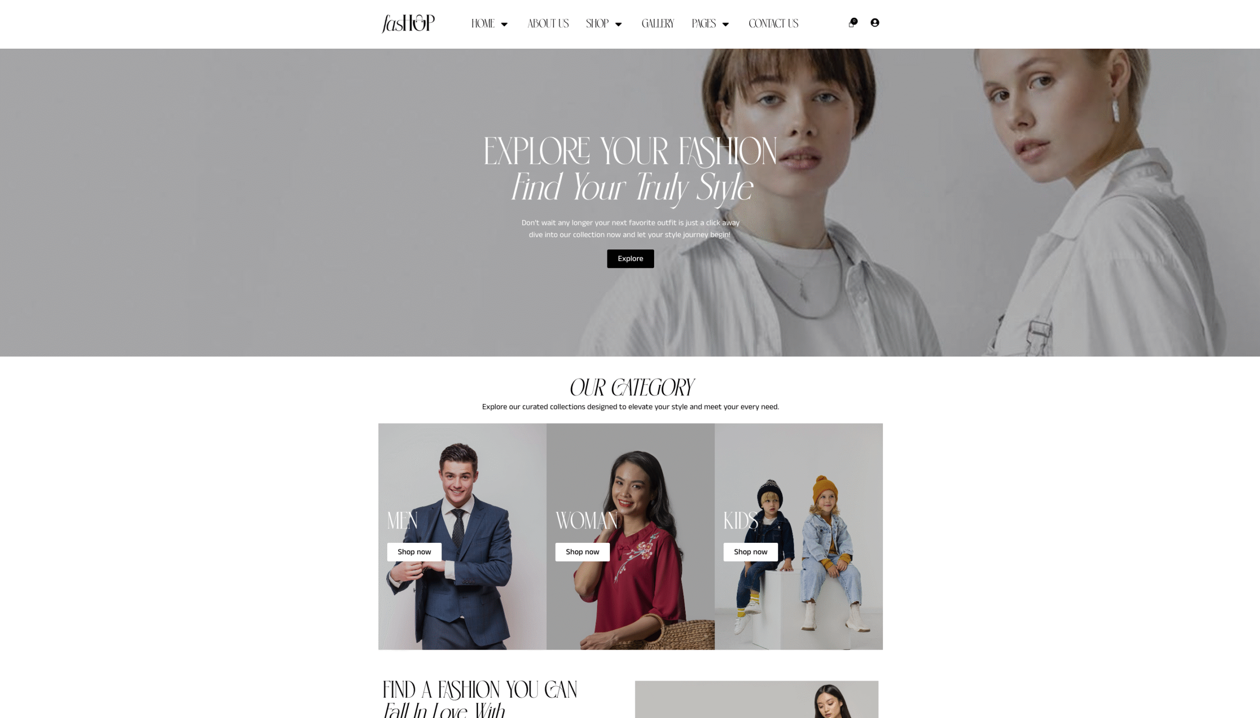
Fashop is a modern and stylish Fashion Marketplace Template Kit, designed for online stores, fashion boutiques, and clothing brands. This template kit carries an elegant and minimalist vibe, which is why it uses Basthan—a font with a minimalist, clean, and elegant visual style. If you want to purchase Fashop, you can click here.
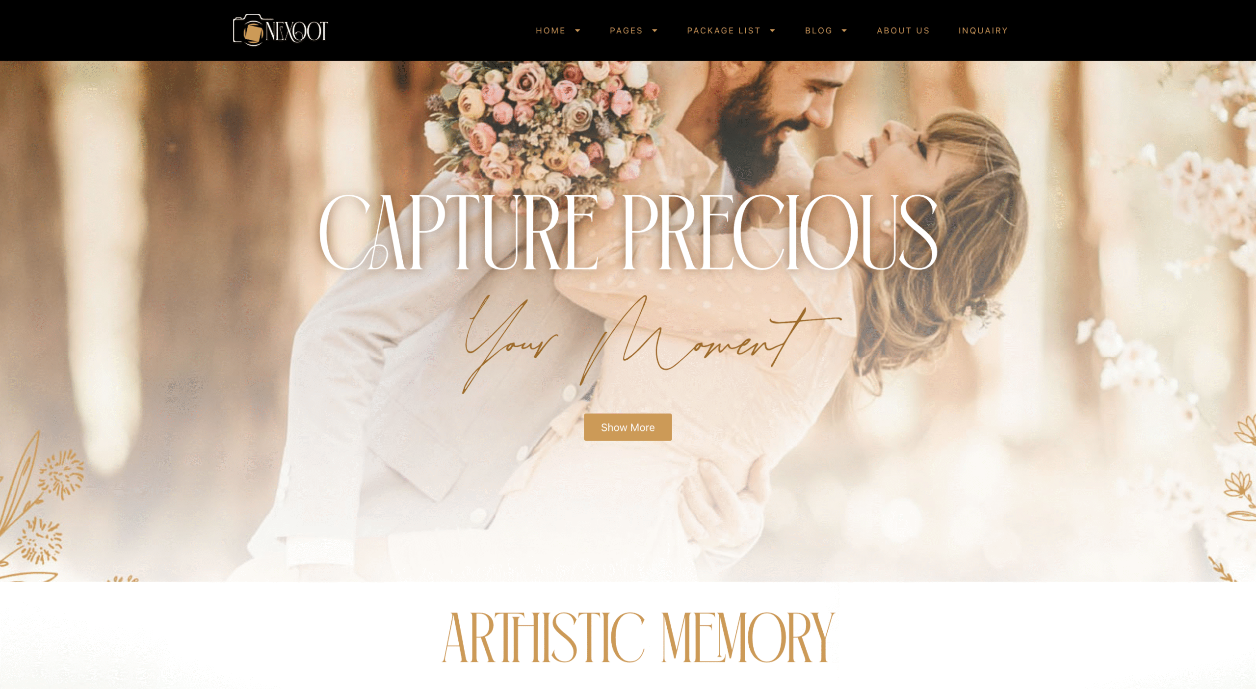
Another example is Nexoot, a classic and modern Elementor Template Kit designed to help photographers and creatives showcase their work in the best way possible. To capture a classic and elegant vibe, we used the Ethareal Elegance font. If you want to purchase Nexoot, you can click here.
Choosing the right font for your website is key to enhancing both its visual appeal and user experience. Don’t underestimate the impact a font can have on how people interact with your site. Explore the diverse collection of fonts at Burntilldead Studio and find the perfect match for your design needs!